Jingyu_Zhang_DUX_A2
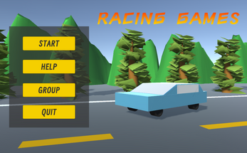
This is PROG2001 Evaluation 2 by Jingyu Zhang, This project is a grey box model for a racing game, it does not represent the final quality, please feel free to give me feedback on how to improve this grey box project.
How to use
1. Click and browse the menu. To start the game, click START on the main menu. To return to the main menu, click 'RETURN' in the top right corner.
2. Click on the buttons in the 'Control Panel' to manipulate the car objects. You can rotate, move and resize the car. To return to the default values, click on the 'Reset' button.
3. For the group work page, you can click on the 'GROUP' button on the main page to enter the catalogue of our group's work, which has the same operating logic as my personal page (the main interface), and click on 'START' to enter the game page; click on 'QUIT' to return to the main page.
| Updated | 5 days ago |
| Published | 7 days ago |
| Status | In development |
| Platforms | HTML5 |
| Author | JingyuZhang-SCU |
| Made with | Unity |

Comments
Log in with itch.io to leave a comment.
On the positive side: Your gray box cleverly embeds the core control logic into the "road sign" system, completely breaking the traditional UI floating feeling. Players control vehicles through directional signs in the scene, retaining the immersion of an open world while achieving natural guidance of functional entrances. This kind of detail processing can be considered a stroke of genius.
However, I have some suggestions: Although yellow blue color collision has high contrast, it can easily cause visual fatigue during the gray box stage. Perhaps you can lower the saturation: change the pure yellow color to "beige+gray", shift the blue color to # 4682B4, and reduce the fluorescence. Even in the next stage of development, the color scheme will be dynamically adjusted based on weather/time - bright yellow blue will be used on sunny days, and a gradient of cool white and deep blue will be used on rainy nights. This is a good example: the "orange background black text" warning sign logic of German traffic signs highlights the core functional areas (such as danger warnings) with "amber gold" and retains low saturation blue for auxiliary information (such as navigation).
Thanks for the feedback, I'll try a new colour scheme in the follow-up.
I think your gray box model was built very well, the light navigation bar with dark text is simple and clear, and does not block the game scene at all, in line with the minimalist style. By trying it out, I get clear interactive feedback. But I think you can also improve the color collocation, the buttons can be set to similar colors, so that more attractive and not obtrusive. The overlap in the background design is somewhat obvious. But overall it was a good game and I enjoyed it very much.
Thanks for the feedback, I'll try a new colour scheme in the follow-up.
On the positive side, the whole scene is well designed, both for the model and the UI design. The model does a good job of identifying its purpose. When it comes to UI design, the words on a button make it clear what the purpose is, and there's plenty of feedback.
However, there seems to be some issues with the return key of the actual scene, it could be because of the canvas size setting or the size setting when uplotizing itch.io, but it's not a big deal.
Overall, it was a good grey-box project.
Thanks for the feedback, I've resized the post on itch.io to avoid cropping due to the page layout.